

PETER ZHANG – APRIL 2ND, 2021
EDITOR: ABHISHEK ROY
Introduction
Even amidst a global pandemic that demands cooperation, American political polarization complicates our public health response. Partisanship has tangible impacts on health outcomes. A study found that states with Democratic governments had better pandemic responses than those with Republican governments, even after controlling for other variables. A later study confirmed that while Republican-led states fared better in the beginning, Democrat-led states have had lower case rates since June 8th.
Part of the explanation lies in individual behavior. For example, Fox News consumption is correlated with less physical distancing, a result of the way right-wing media downplayed the virus at the beginning of the outbreak. Researchers have also shown that partisanship is the strongest predictor of mobility—how likely someone is to travel. These differences in distancing have, in turn, been associated with increased case and fatality rates.
None of these previous studies, however, took advantage of the 2020 election results. These are interesting data points. Time reported that—unsettlingly—the counties with the most COVID cases were also the biggest fans of President Trump. Election results offer more information than a binary red/blue label on state governments—measuring the magnitude of political support, while also distinguishing Republicanism from Trumpism. Otherwise, we’d have put my dark-blue home state of Maryland in the same basket as my previous home, the dark-red North Dakota.
Moreover, these studies are exclusively focused on states and their governments. State-level data is highly aggregated, which exaggerates county-level effects and makes it difficult to establish statistical significance.
Dataset
We built a novel, county-level dataset. To test the strength of the partisanship-COVID relationship, we controlled for significant predictors of COVID cases, such as race, density, and age. To test potential mechanisms for the relationship, we also collected data on mask use and mobility. We compiled the following data sources:
- Demographics (race, income, age, etc.) from 2010 U.S. Census.
- COVID cases and deaths compiled from New York Times data.
- County mask usage from a New York Times survey
- Testing rates collected by John Hopkins University.
- Mobility data from the Department of Transportation.
- 2016 and 2020 presidential election results scraped from news sources.
After merging the datasets, we had 3,111 complete rows, covering nearly every county. Below are summary statistics for each feature, with the COVID cases/deaths omitted for brevity.
We subtracted Trump’s proportion of votes from that of Biden’s (for Montgomery County, which had 79% for Biden and 19% for Trump, this would be 0.60). We dubbed this measure of partisanship the “Biden Margin.”
Exploratory Data Analysis
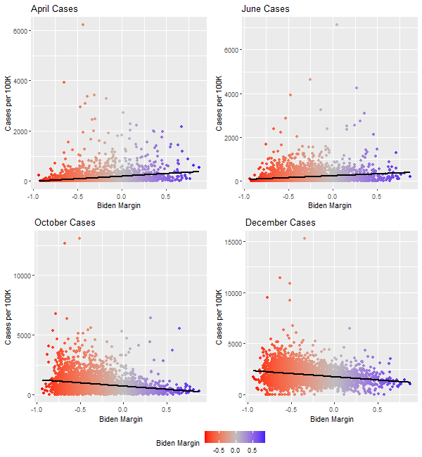
We began by visualizing COVID cases and deaths in April, June, October, and December, which roughly represent the different stages of the pandemic. Based on previous literature, we would expect June to be the “turning point” where blue states began to see fewer cases and deaths than red states.
The trend is generally validated—while blue states had more cases in April (r = 0.22), that trend began to reverse in June (r = 0.17), with a stronger, opposite relationship in December (r = -0.22).
Figure 1. COVID-19 Cases by Biden Margin
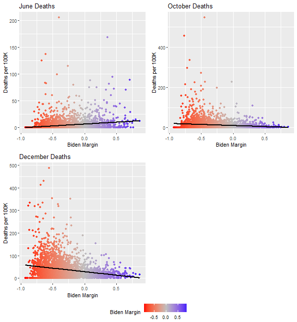
A similar story holds for the death rates, which are plotted below (April is omitted because there were very few recorded deaths). From June (r = 0.20) to October (r = -0.12) to December (r = -0.23), the relationship between partisanship and COVID deaths reversed. By December, every single county with more than 150 deaths per 100,000 was a red state. The differences are stark.
Figure 2. COVID-19 Deaths by Biden Margin
Two further observations are important. First, 2016 election results are not as strongly correlated with December cases (r = -0.20 v. -0.22) or deaths (r = -0.22 vs. -0.23). It suggests that over the last four years, the political alignments have shifted. Second, state-level election results are less predictive of December cases (r = -0.15 v. -0.22) and much less predictive of deaths (r = -0.07 vs. -0.23) compared to county-level election results. This validates the idea that county-level granularity boosts predictive power.
Models
We used the following variables in regression:
- cases and deaths refer to December COVID-19 cases and deaths per 100,000, respectively.
- density was thousands of residents per square mile.
- income was the median household income in thousands of dollars.
- elderly was the proportion of residents aged 60 and older.
- black and hispanic were the proportion of the respective races.
- county_margin was the Democratic margin at the county level
- trips were the average number of trips people made over a period in December.
- mask_use was the percent of people who reported wearing masks “all the time” on a survey.
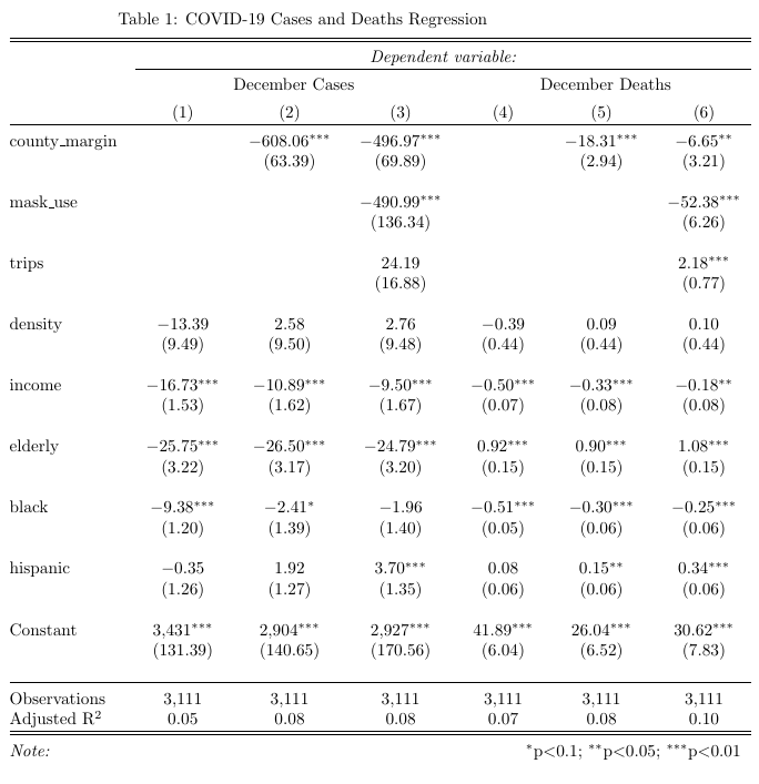
We used six OLS models. The first and fourth models predict case and death rates respectively from non-partisan demographic features. The second and fifth models assess the additional impact of county partisanship. Models three and six test the extent to which social distancing mediates the relationship.
- dec_cases ~ tests + density + income + elderly + black + hispanic
- dec_cases ~ county_margin + tests + density + income + elderly + black + hispanic
- dec_cases ~ county_margin + mask_use + trips + at_home + tests + density + income + elderly + black + hispanic
- dec_deaths ~ density + income + elderly + black + hispanic
- dec_deaths ~ county_margin+ density + income + elderly + black + hispanic
- dec_deaths ~ county_margin + mask_use + trips + at_home + tests + density + income + elderly + black + hispanic
Results
Figure 3. Regression Results
Discussion
Overall, explaining county-level variation is hard. The best model (Model 6) explains only 13.7% of the variation in county-level deaths. In contrast, using fewer features than we used, a previous study accounted for 69% of the variation in state-level cases. The difference suggests researchers conducting regression on state-level data should be cautious about extrapolating results to counties. It also indicates case rates are complex and may be influenced by factors outside of a county’s control.
In line with past studies, density has no significant relationship with either cases or deaths. On the other hand, race and class do have significant impacts. A higher median household income is associated with significantly fewer cases and deaths. And, Hispanic populations seem to have a highly significant association with more cases and deaths, a result corroborated with other studies.
The proportion of black residents initially had a highly significant, depressing effect on both case rates and death rates, but the effect is strongly mitigated after controlling for the county margin. The variable is likely confounded by partisanship: bluer counties are farther North and more diverse.
The proportion of people aged 60 and older has a highly significant negative effect on the case rate, but also a significant positive effect on the death rate. The paradox may reflect a sad reality: older communities try harder to shield themselves from COVID, but ultimately still face higher mortality rates.
County partisanship has a highly significant impact on outcomes. After controlling for demographic variables, county election results explain an additional 3% of the variance in cases, and 1% in the variance of deaths. Each 1% increase in the margin of Democratic votes is associated with a decrease of 6 cases and 0.18 deaths per 100,000.
Mask use has highly significant depressing effects on both case rate and death rate. The number of trips has significant effects on the death rate. These measures mediate some of the observed relationships between partisanship, cases, and deaths, helping us explain part of why bluer states do better: they practice more social distancing. Yet, the persistent significance of partisanship means that there’s more to the story: perhaps institutional factors or subtler individual choices explain the rest.
Conclusion
We examined the relationship between partisanship, COVID outcomes, and related explanatory variables. The results largely corroborate existing research on standard explanatory factors and highlight the difficulty of explaining county-by-county variance. County partisanship has a highly significant impact on case rates and death rates that persists after controlling for explanatory variables. The effect is mediated in part by social distancing measures, specifically mask use and decreased travel.
The analysis was subject to several limitations. The test data were only available at the state level, so the models may have failed to fully control for testing rates. Many demographic features used 2010 Census data, which may not reflect the current state of the country. Normality and homoscedasticity were assumed for the data, but that assumption may be inaccurate, particularly for the mobility data.
Future analyses could consider the dates and extent of policy interventions like restaurant closures and gathering restrictions as explanatory variables. It could also be updated with 2020 Census and ACS data. Moreover, the time frame can be extended into the future months or past months to assess the change in relationships over time.
Featured Image Source: FiveThirtyEight
Disclaimer: The views published in this journal are those of the individual authors or speakers and do not necessarily reflect the position or policy of Berkeley Economic Review staff, the Undergraduate Economics Association, the UC Berkeley Economics Department and faculty, or the University of California, Berkeley in general.